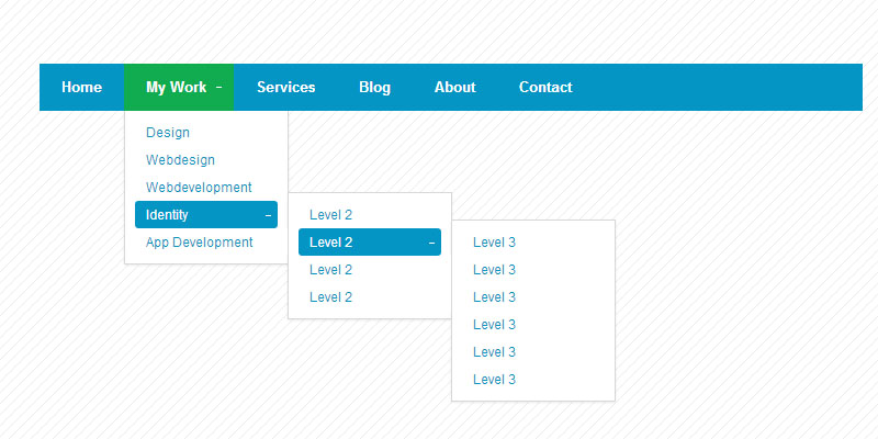
Today I am going to share with you a tutorial to create multilevel header navigation bar in CSS3 in a very simple manner.

This CSS3 navigation is supported by modern browser only i.e. Chrome, Mozilla, Safari etc. The earlier version of IE 6 or 7 will not be compatible for this navigation.
Step 1
Open Dreamweaver or and other HTML editor and create an html file and name it index.html (or any other name), Put following code into it and save the doc.
<!DOCTYPE html>
<html>
<head>
  <title>Simple Minimal CSS3 Navigation by W3update.com</title>

	<link rel="stylesheet" type="text/css" href="css3-navigation.css">
	<style type="text/css">
		body {
			background: url('img/pattern.png');
		}

		.nav {
			top: 150px;
			left: 150px;
		}
	</style>
</head>
<body>

<ul class="nav">
	<li><a href="#">Home</a></li>
	<li class="dropdown">
		<a href="#">My Work</a>
		<ul>
			<li><a href="#">Design</a></li>
			<li><a href="#">Webdesign</a></li>
			<li><a href="#">Webdevelopment</a></li>
			<li class="dropdown">
				<a href="#">Identity</a>
				<ul>
					<li><a href="#">Level 2</a></li>
					<li class="dropdown">
						<a href="#">Level 2</a>
						<ul>
							<li><a href="#">Level 3</a></li>
							<li><a href="#">Level 3</a></li>
							<li><a href="#">Level 3</a></li>
							<li><a href="#">Level 3</a></li>
							<li><a href="#">Level 3</a></li>
							<li><a href="#">Level 3</a></li>
						</ul>
					</li>
					<li><a href="#">Level 2</a></li>
					<li><a href="#">Level 2</a></li>
				</ul>
			</li>
			<li><a href="#">App Development</a></li>
		</ul>
	</li>
	<li><a href="#">Services</a></li>
	<li><a href="#">Blog</a></li>
	<li><a href="#">About</a></li>
	<li><a href="#">Contact</a></li>
</ul>

</body>
</html>
Step 2
Create a CSS file called navigation.css (or choose any other name) if you are choosing any other name the same should be rightly mentioned in html file at code line 6 where external link is linked. Put following CSS codes into it and save it.
/*-----------------------------------------------------------------------------------

Project Name: Simple Minimal CSS3 Navigation
Tutorial Website URI: www.w3update.com
Description:Sterling is a Responsive WordPress Theme with a multitude of amazing CMS features.
Author: w3update.com
Author URI:http://www.w3update.com
Version:1
License:GNU General Public License
License URI:license.txt
*/

/* The main container */
.nav {
  /* Layout & positioning */
	display: block;
	position: relative;
	margin: 0;
	padding: 0;
	width: 750px; /* CHANGE this if you want another width or remove it if you want the width of the container */
	height: 43px;
	list-style: none;

	/* Background */
	background: #0595c4;
}

.nav>li {
	display: block;
	float: left;
	margin: 0;
	padding: 0;
	position: relative;
}

/* The main navigation links */
.nav>li>a {
	/* Layout & positioning */
	display: block;
	padding: 15px 20px;
	line-height: 13px;

	/* Typography */
	font-family: Helvetica, Arial, sans-serif;
	text-decoration: none;
	font-size: 13px;
	color: #fff;
	font-weight: bold;

	/* Effects */
	-webkit-transition: background .2s;
	-moz-transition: background .2s;
	-o-transition: background .2s;
	-ms-transition: background .2s;
}

/* The hover state of the navigation links */
.nav>li>a:hover, .nav>li:hover>a {
	background: #11ac4f;
}

.nav>.dropdown>a {
	padding-right: 25px;
}

/* The '+' sign which indicates a submenu */

.nav>.dropdown>a::after {
	 content: "";
	 position: absolute;
	 top: 19px;
	 right: 13px;
	 width: 1px;
	 height: 5px;
	 background: #fff;
}

.nav>.dropdown>a::before {
	 content: "";
	 position: absolute;
	 top: 21px;
	 right: 11px;
	 width: 5px;
	 height: 1px;
	 background: #fff;
}

.nav>.dropdown>a:hover::after, .nav>.dropdown:hover>a::after {
	background: transparent;
}

/* General submenu styling */
.nav ul {
	position: absolute;
	list-style: none;
	margin: 0;
	padding: 0;
	padding: 7px 0;
	background: #fff;
	left: -9999px;
	border-bottom: 1px solid #d8d8d8;
	border-left: 1px solid #d8d8d8;
	border-right: 1px solid #d8d8d8;
	box-shadow: 0 1px 2px rgba(0, 0, 0, .08);
}

.nav ul li {
	position: relative;
	background: #fff;
	padding: 0 9px;
	width: 0px;
	height: 0px;
	-webkit-transition: height .3s, width .3s;
	-moz-transition: height .3s, width .3s;
	-o-transition: height .3s, width .3s;
	-ms-transition: height .3s, width .3s;
}

/* Level 1 submenus */
.nav>li:hover>ul {
	left: 0px;
}

/* Level 2+ submenus */
.nav ul ul {
	border-top: 1px solid #d8d8d8;
}

.nav ul>li:hover>ul {
	top: -8px;
	left: 148px;
}

/* Expanding the submenus on hover */
.nav li:hover>ul>li {
	width: 130px;
	height: 25px;
}

/* The links of the submenus */
.nav ul li a {
	/* Layout */
	display: block;
	position: relative;
	padding: 5px 10px;
	border-radius: 3px;
	width: 110px;

	/* Typography */
	font-family: Helvetica, Arial, sans-serif;
	font-size: 12px;
	text-decoration: none;
	color: #0595c4;

	/* Effects */
	-webkit-transition: all .2s;
	-moz-transition: all .2s;
	-o-transition: all .2s;
	-ms-transition: all .2s;
}

/* The hover state of the submenu links */
.nav ul li a:hover, .nav ul li:hover>a {
	background: #0595c4;
	color: #fff;
}

/* The '+' sign indicating a level 2+ submenu */
.nav ul>.dropdown>a::after {
	 content: "";
	 position: absolute;
	 top: 11px;
	 right: 8px;
	 width: 1px;
	 height: 5px;
	 background: #0595c4;
}

.nav ul>.dropdown>a::before {
	 content: "";
	 position: absolute;
	 top: 13px;
	 right: 6px;
	 width: 5px;
	 height: 1px;
	 background: #0595c4;
}

.nav ul>.dropdown:hover>a::after {
	background: transparent;
}
.nav ul>.dropdown:hover>a::before {
	background: #fff;
}
Step 3
Create a folder called img and upload pattern.png file, the name of the file should be rightly mentioned in html doc at line 9.
|
[button color=”red” size=”small” link=”http://www.w3update.com/demo/Simple-Minimal-CSS3-Navigation/css3-menu.html” target=”blank” ]Demo[/button] |
[button color=”red” size=”small” link=”https://github.com/w3update/Simple-minimal-CSS3-Navigation/archive/master.zip” target=”blank” ]Download[/button] |