

1 min readFreebies

How to create multilevel responsive navigation?

responsive-multilevel-navigation

What does it means by responsive? This is a new web technique that resizes your web page according to the browser screen size. These days there are different types of devices with the internet connectivity are available in the market i.e. Mobile, Tablet and Phablet etc. now opening a website is not limited up to desktop or laptop only now it is accessible by mobile phones, tablet and phablet too.

responsive-multilevel-navigation

Rather than creating and maintaining different websites for different device needs responsive design let resize a single webpage to serve different screen size of device.

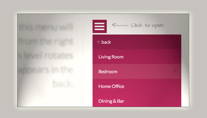
Towards this development here in this post I am going to cover a wonderful tutorial that gives you an idea to build up multilevel responsive navigation system for your website.
[button link=”http://tympanus.net/codrops/2013/04/19/responsive-multi-level-menu/” size=”medium” target=”_blank”]Access Tutorial[/button] [button link=”http://tympanus.net/Development/ResponsiveMultiLevelMenu/” size=”medium” target=”_blank”]Demo[/button] [button link=”http://tympanus.net/Development/ResponsiveMultiLevelMenu/ResponsiveMultiLevelMenu.zip” size=”medium” target=”_blank”]Download Source[/button]

About the Author

Durgesh Gupta's profile picture

Durgesh Gupta

Author

Content Writer at WebAnaya

Helping Businesses Scale with AI and SaaS Solutions | Founder @ WebAnaya | 20+ Years Experience in Full-Stack, Digital Growth & Cloud Management

Published: April 23, 2013

Related Posts

Awesome UX Kit: 26 variant of iOS7 wireframes in AI Format

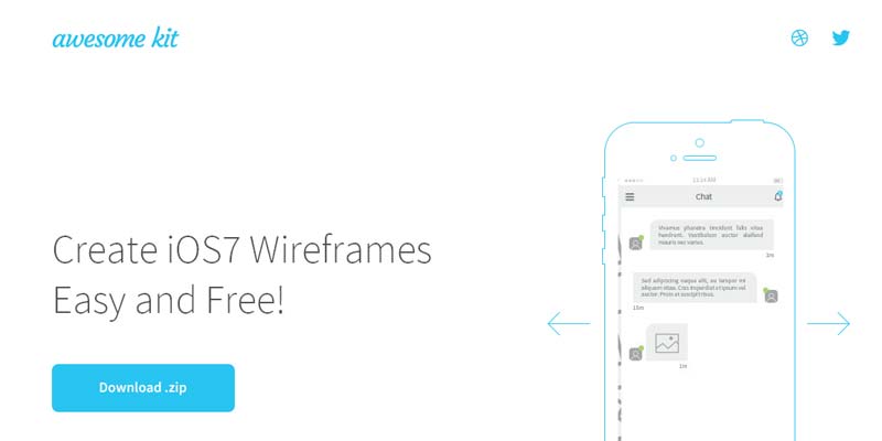
Awesome UX Kit kit contains the 26 varient of iOS7 wifeframes which can be very useful to iOS UI designer and developer to design variety of UI to iOS7 running device i.e. Apple iPhone (only). All set of files are freely available to download in Adobe Illustrator format, this wireframes designed by George Vasyagin. Demo/Download

Read article